Illustration:
+ Wrights Brothers
+ Noble Rot Magazine
+ Queens Park Books
+ Buildings/spaces
+ Amnesty International
+ Short animations
Design:
Onto
+ Under the Hood
+ Paid ads
+ TV advert roll out
+ Company values
+ Events design
+.Getting Started Guides
Long Tall Sally
+ Curatd By exhibition
+ True To My Size campaign
+ Summer 19’ launch
+ Karl Lagerfeld Paris
+ Sustainability
Boots
+ No7 Serum Launch
+ No7 Match Made
make up launch
British Heart foundation
+ Big Beat Challenge
+ BHF Lottery
+ Customer reassurance
animation
+ Dechox campaign creation
Other Brands
+ Energy Systems Catapult
2024 Wrapped video
+ Energy Systems Catapult
paid ads
+ Design Museum
exhibition Posters
+ Mesa Clay
+ Solihull Gallery Card
+ Rehash
+ Cityscape Digital
+ Elite Inspirations
+ The Bakers Apron
+ Denim Events
+ Bee Vocal
+ Muse
Conceptual:
+ Generative systems
+ Scaling
+ Length tool
+ Apple trees
+ Communication double
exposure photography
+ Poster collection
Artists' Books:
+ Corner project
+ Corner project variations
+ 5 minute journey book
+ Tube stop books
+ Measuring length
About me
Get in touch
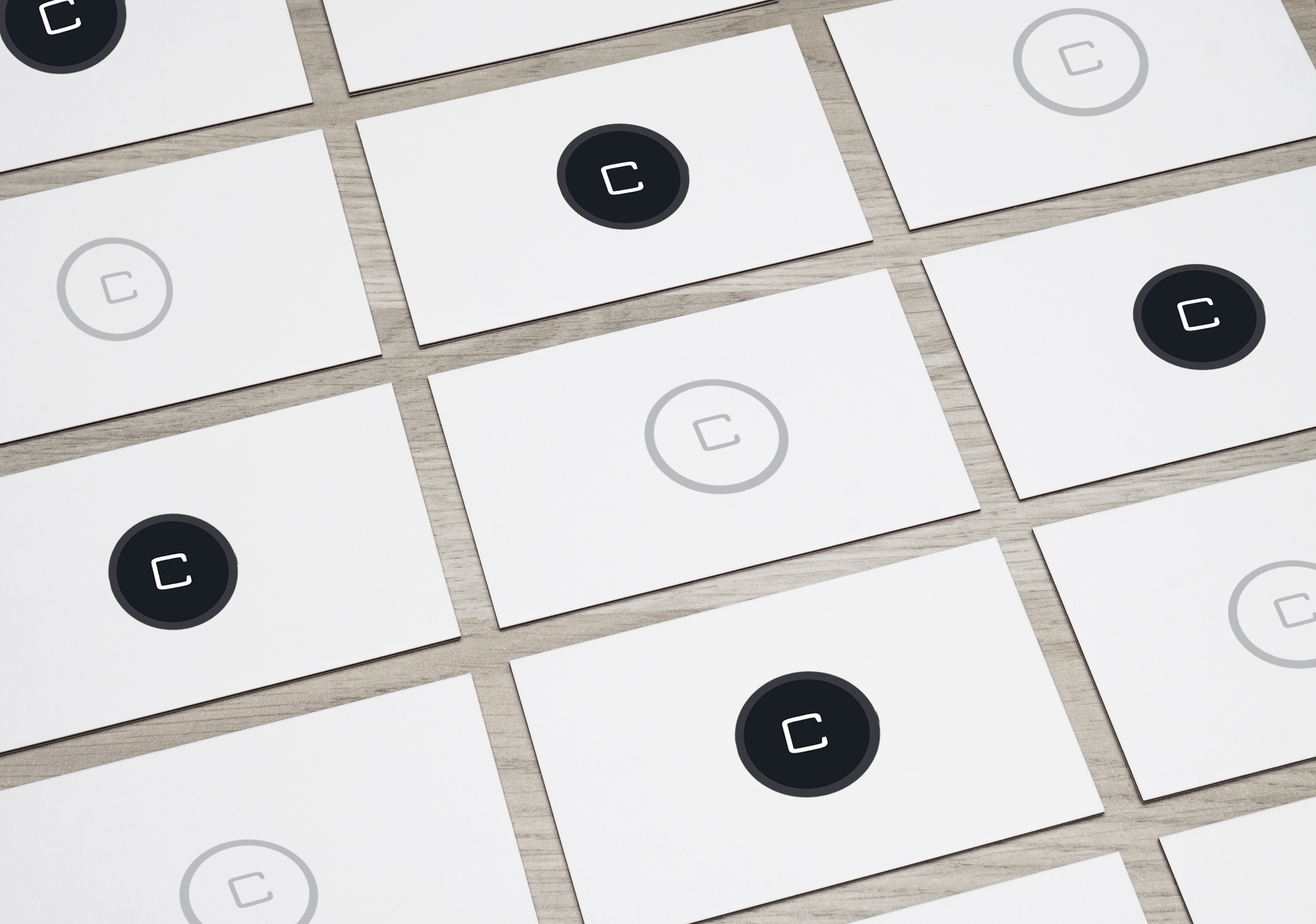
Solution: Simplifying the name and creating a symbol was key. We designed a symbol that consisted of the letter ‘C’, rather than using the full company name as it did before.
The new brand refresh would consist or a new simplified style, which was carried forward across all platforms, externally and internally. This symbol was to act as a stamp when placing it on Cityscape Digital imagery, stationary.